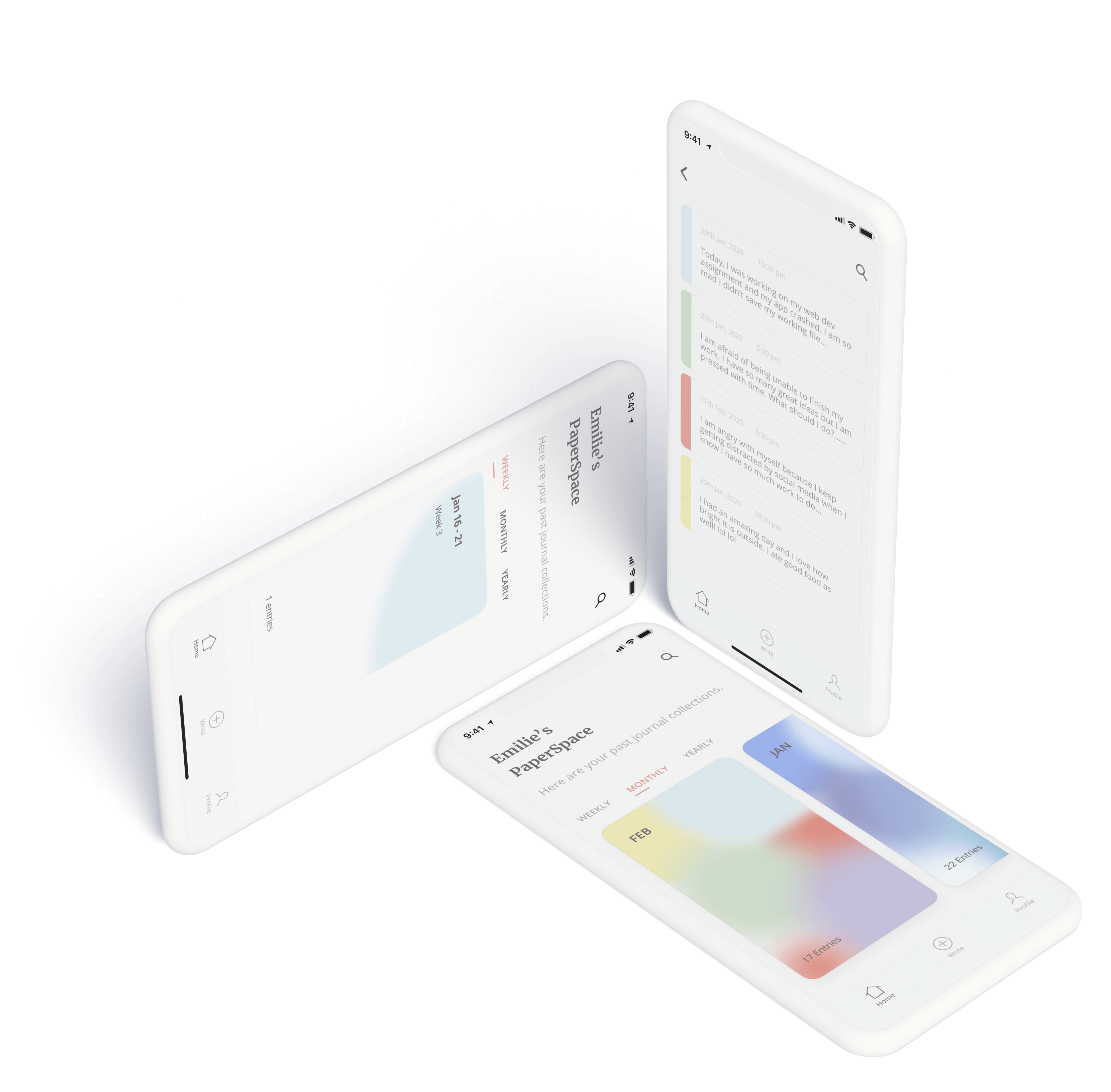
PaperSpace helps people to track and visualize emotions through journal writing. It also offers guided prompts for users who need a kick-starter to write. These two features are meant for motivating users to keep journaling consistently and helping them to better reflect on their emotions.
In this project, we completed the full cycle from design to development. I led the UI/UX design and facilitated the design sprint. During the development phase, I was mostly working on the front-end and responsible for CSS visual effects.
MY ROLE
Design Sprint Facilitator
Facilitated team collaboration on user research, qualitative data synthesis, feature prioritization, user flows, inspiration findings, wireframe sketching
UI/UX Designer
Responsible for digital wireframing, prototyping, and UI design
Front-end Developer
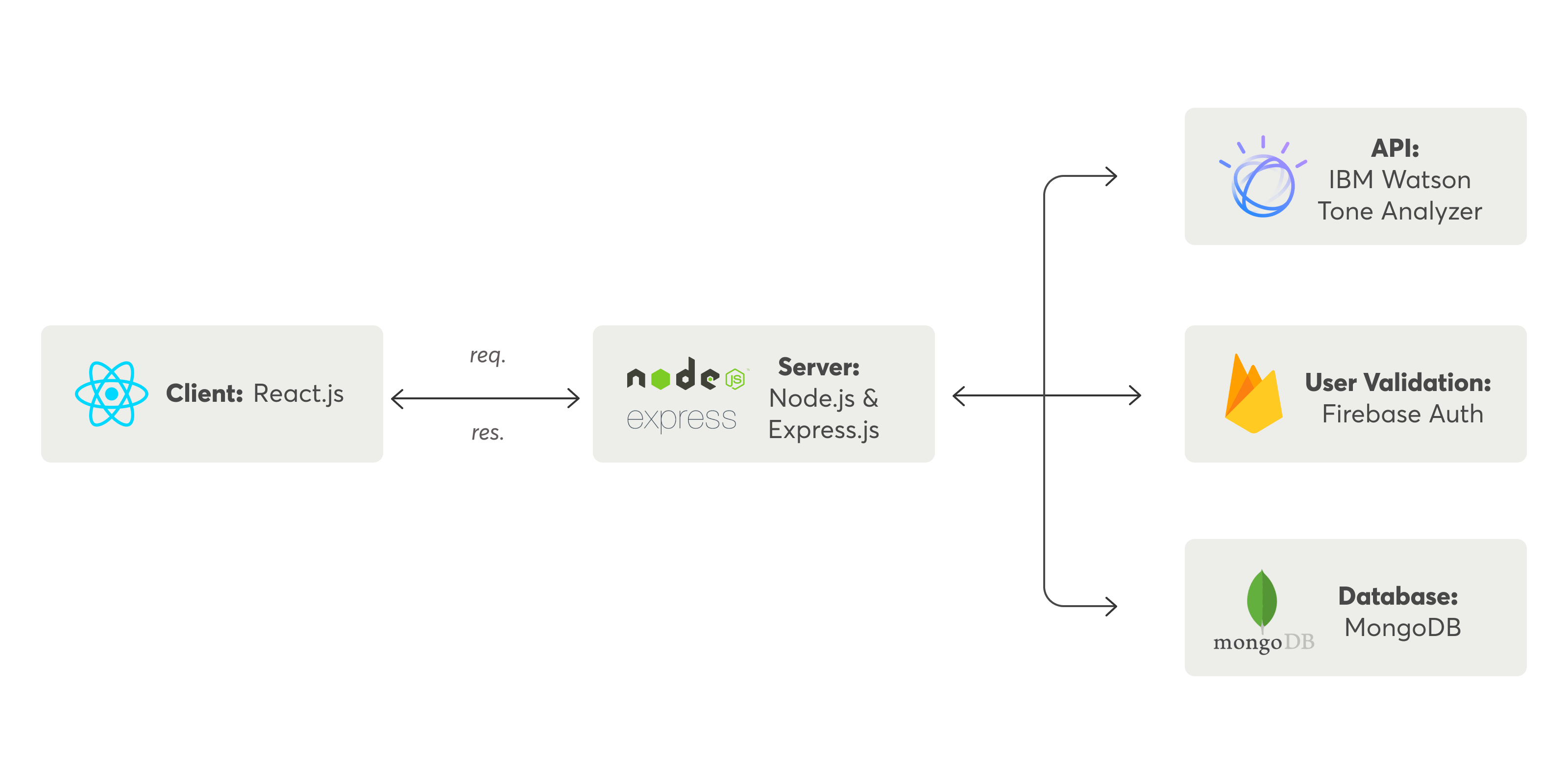
Assisted with creating React components, responsible for visual effects and transitions, and set up the Watson Tone Analyzer API
PLATFORM + CLIENT
Web Application
Academic Project
TOOLS
Figma, Miro, Invision
MERN Stack, Sass, Watson Tone Analyzer API, Firebase, MongoDB
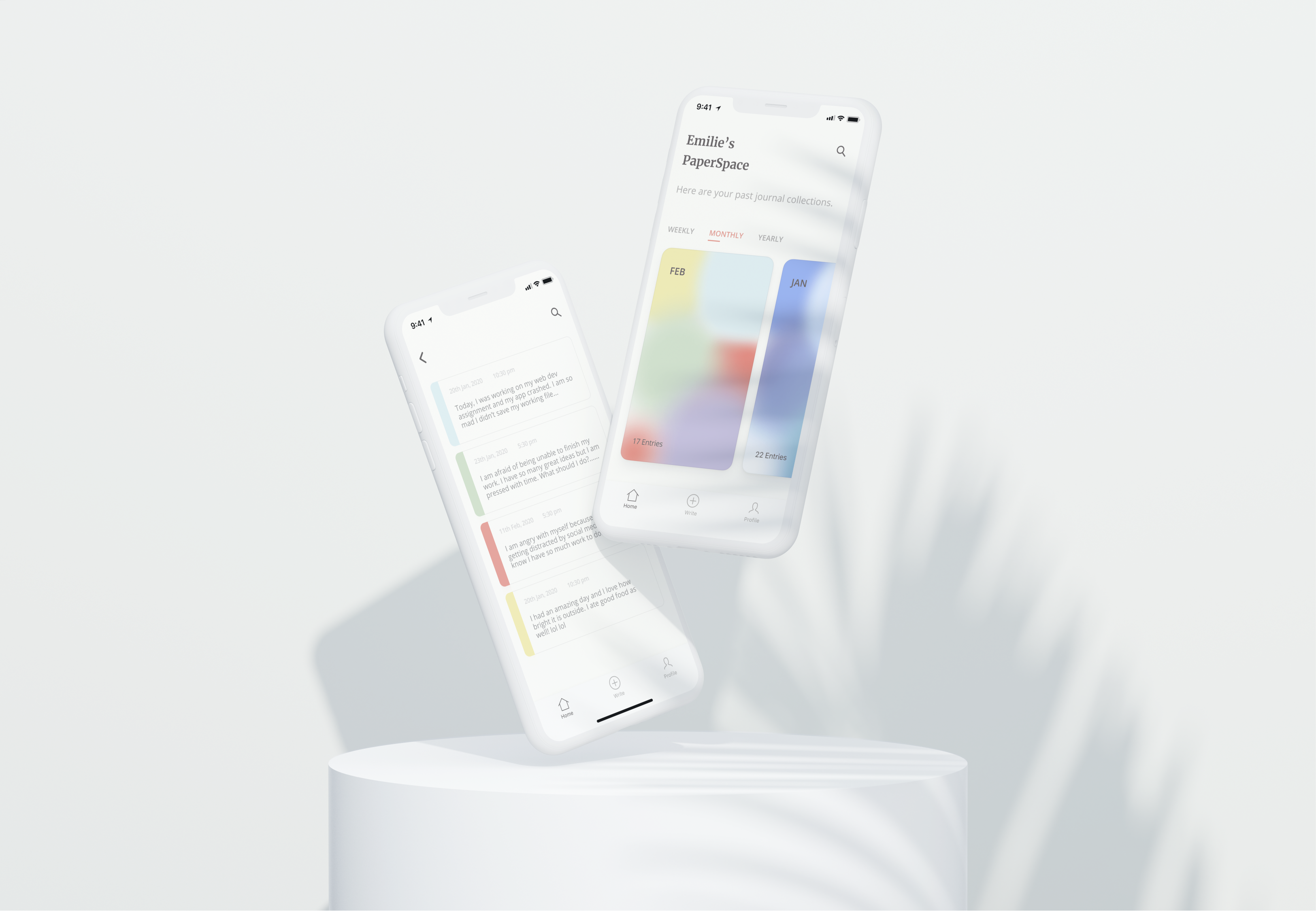
A personal approach in digital journaling
The trend of journaling has been growing significantly over the past years. People use it to keep track of daily tasks in order to boost productivity, and many see journaling as therapy sessions for mindfulness and self-care.
For this project, our group decided to take a personal approach to digital journaling and to see how we could bring a better journaling experience.
USER RESEARCH
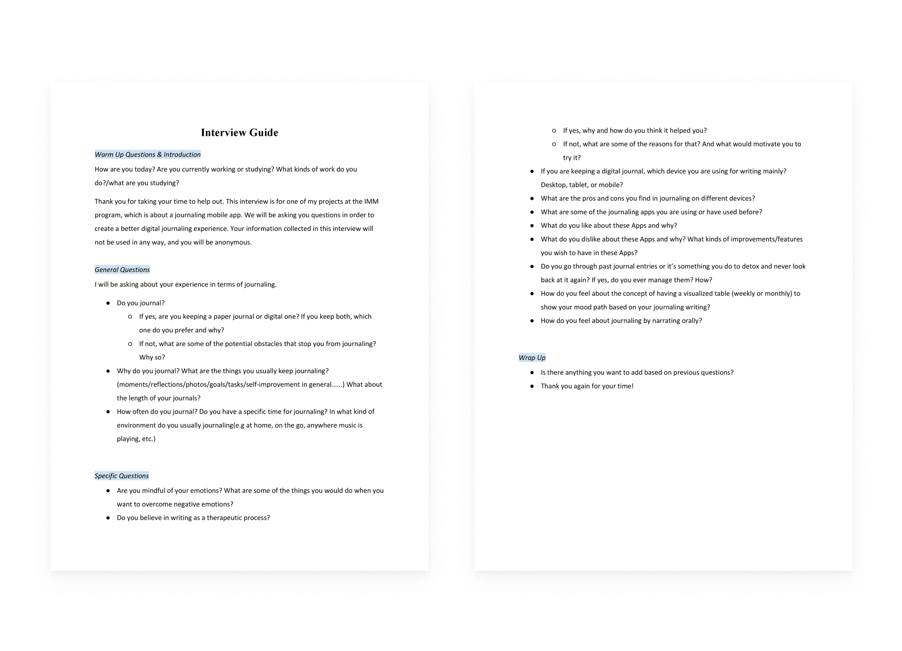
Talking to the User
MAIN INSIGHTS
Finding the Patterns
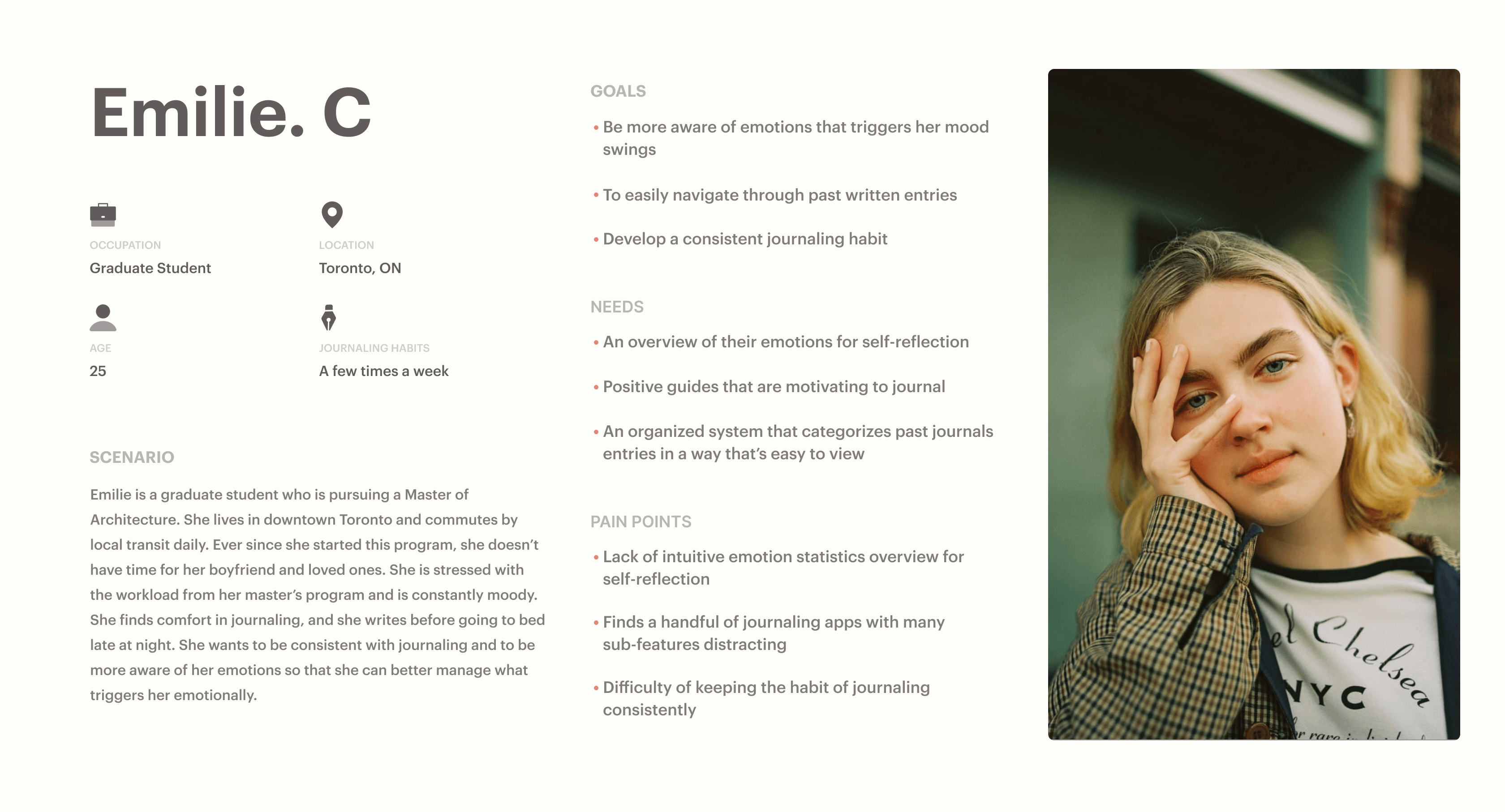
The synthesis process is to make sense of the data and form an understanding of the user group. We collaboratively did affinity mapping on the Miro board and prioritized three main themes that mentioned the most.
*There were themes that also valuable for our design such as the need for categorize system, the habit of journaling(journaling at night), and the concerns for data privacy.
1
“For me, journaling is a way to put out my negative emotions and have a better understanding of my trigger point."
Finds Journaling Therapeutic
2
“I really want to journal every day but It’s hard to find the motivation to write consistently on a daily basis.”
Unable to Journal Consistently
3
“Some journaling Apps have too many sub-features and I find them very distracting. I just need a place to write. “
Values the Core Experience
of Writing
IDEATION
The Road to the Solution
This ideation process includes defining potential features, user flows, and explores possible solutions to solve the users’ needs. The collaboration allowed us to form a shared understanding and create ownership for the product among the team.
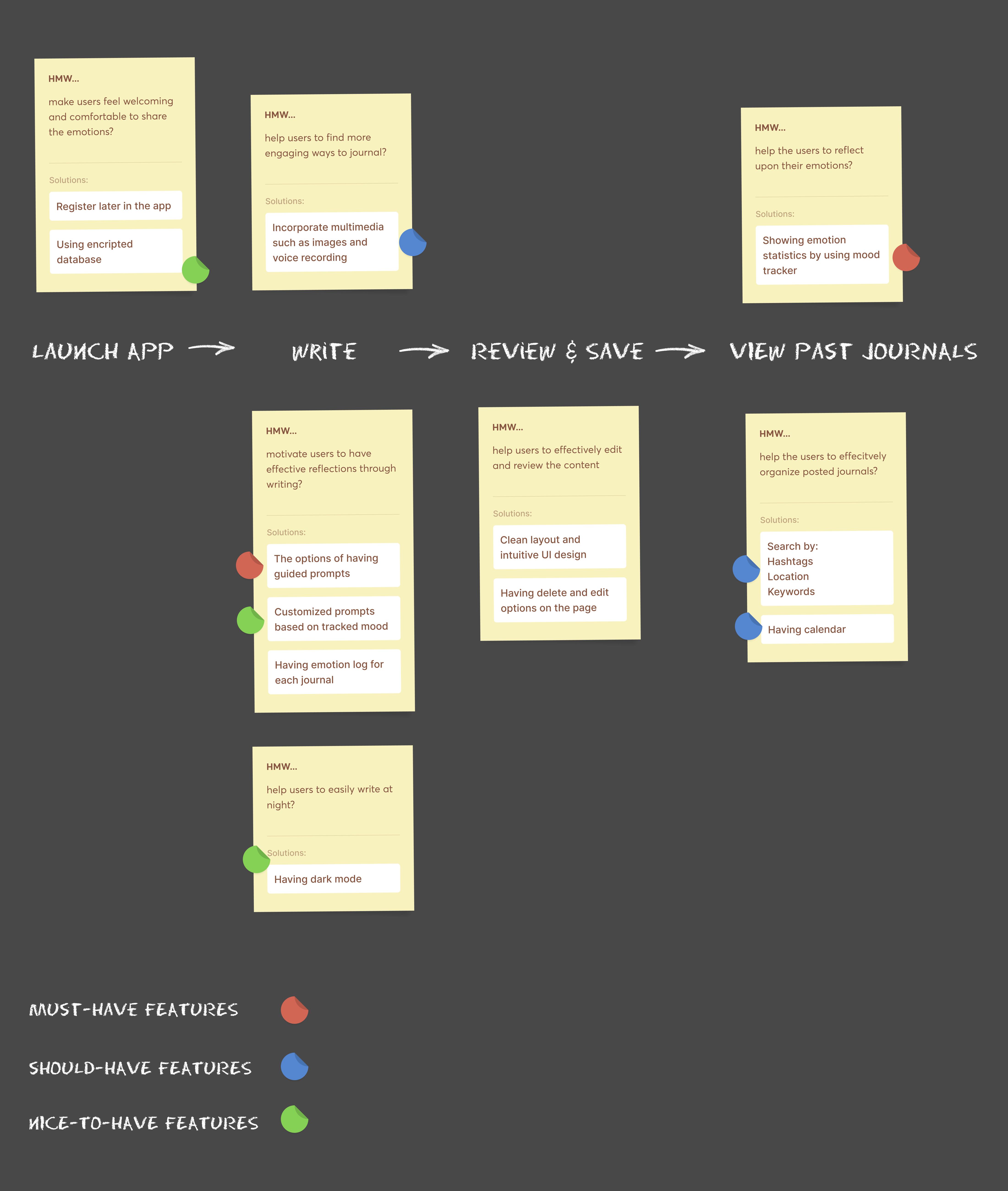
HOW MIGHT WE'S
Started with the higher level of the user task, we generated potential features by asking HMW questions for each step, and we decided their priority based on the users' needs.
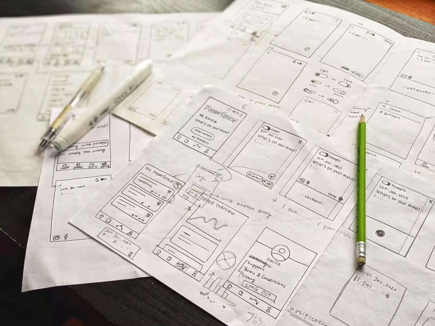
WIREFRAME SKETCHES
With the potential features in mind, we started wireframing and tested out different ideas and components while sketching.
CONSTRAINTS & OBSTICLES
Problem 01 - Too many features won’t work
We realized we were trying to fit too many features in the app without considering the technical feasibility in the given time.
Problem 02 - Our solution is conventional
The mood statistics manifested in charts and graphs are widely adopted from the journaling apps in the current market, and we want to explore something that’s more intuitive rather than mechanical.
SOLUTION
Balancing between what the users need, what tools are available, and what we could do within a limited timeline.
01
Only focusing on “must-have” features
We removed all the “should-have” and “nice-to-have” features and choose to only focus on developing the core feature of this app - the mood tracker and guided prompts.
02
Finding possibilities through tech research
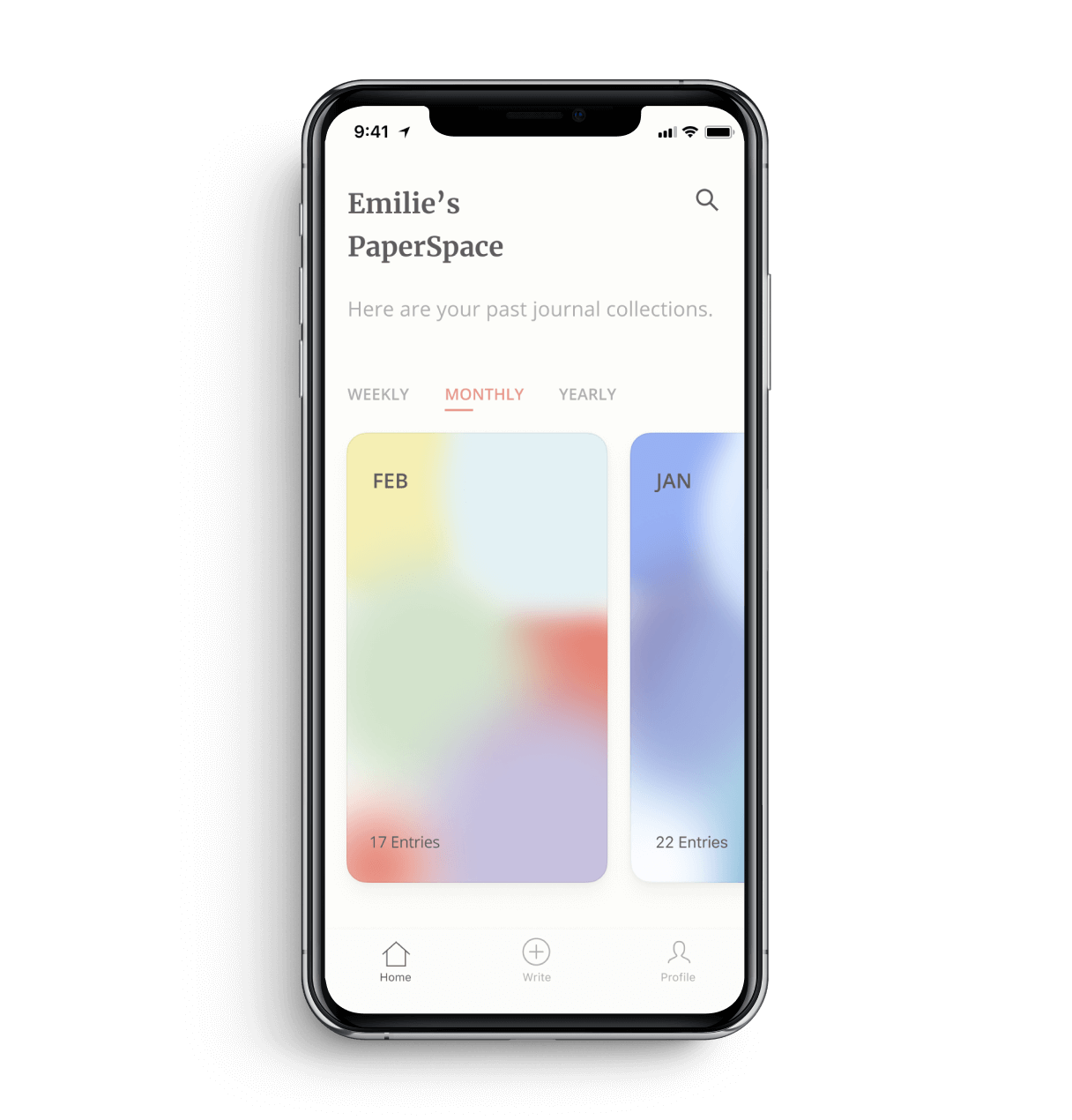
We discovered the Watson Tone Analyzer API from IBM during tech research, which allows for analyzing emotions in written format. This discovery partly shaped our final design to use color-coded gradients indicator to replace mechanical statistics.
Hey there, this is the default text for a new paragraph. Feel free to edit this paragraph by clicking on the yellow edit icon. After you are done just click on the yellow checkmark button on the top right. Have Fun!
01
Card Gradients as Mood Indicators
Color-coded categories to visualize users’ emotions based on your writing content over weekly, monthly, or yearly.
The visualization summarizes your emotions and gives incentive for users to keep journaling.
02
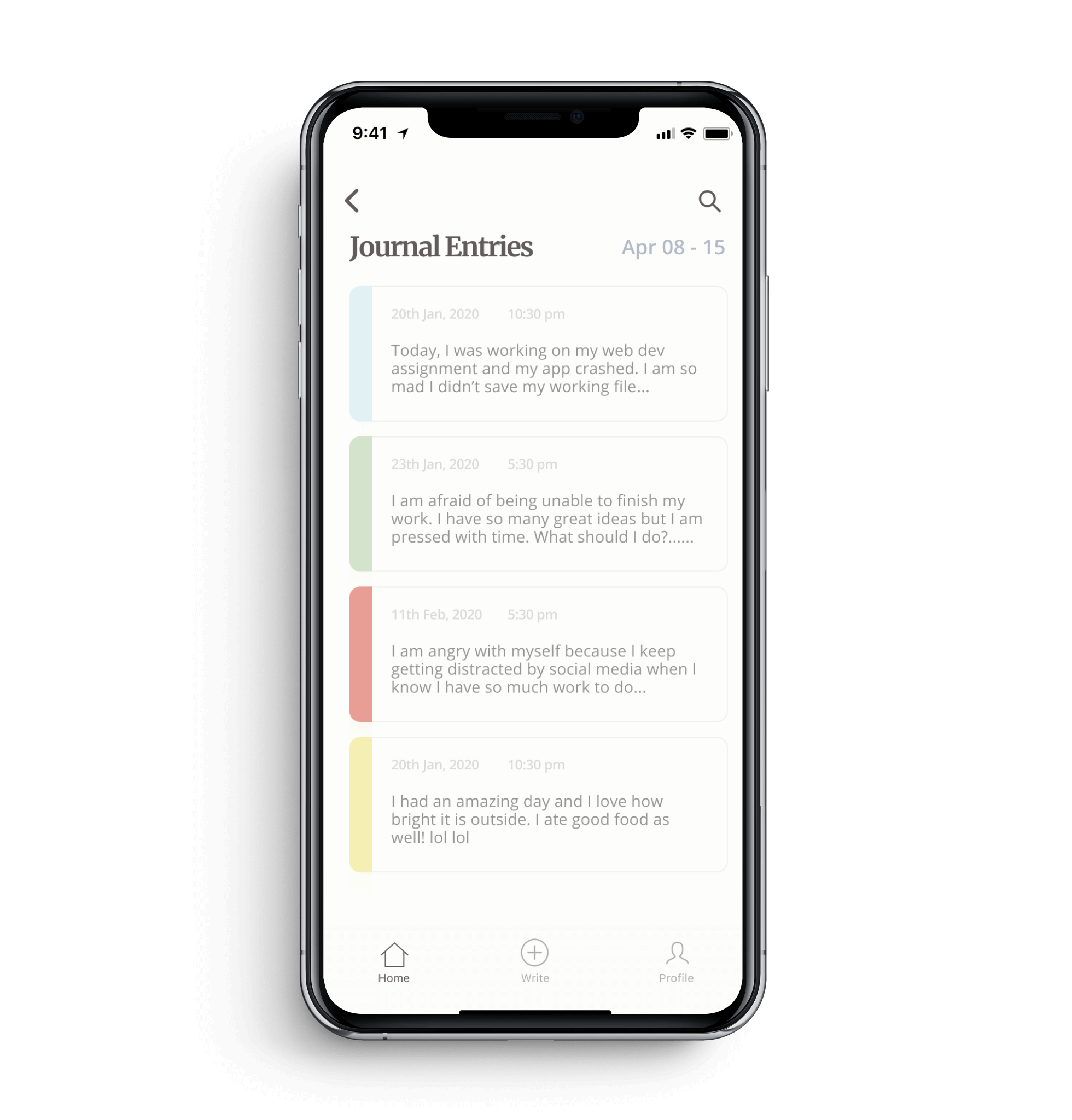
Color-coded Entries with Respective Moods
Each color with its respective mood showed on the entry cards based on your writing content.
The color-coded list gives users direct visualization of their emotions for each entry.
03
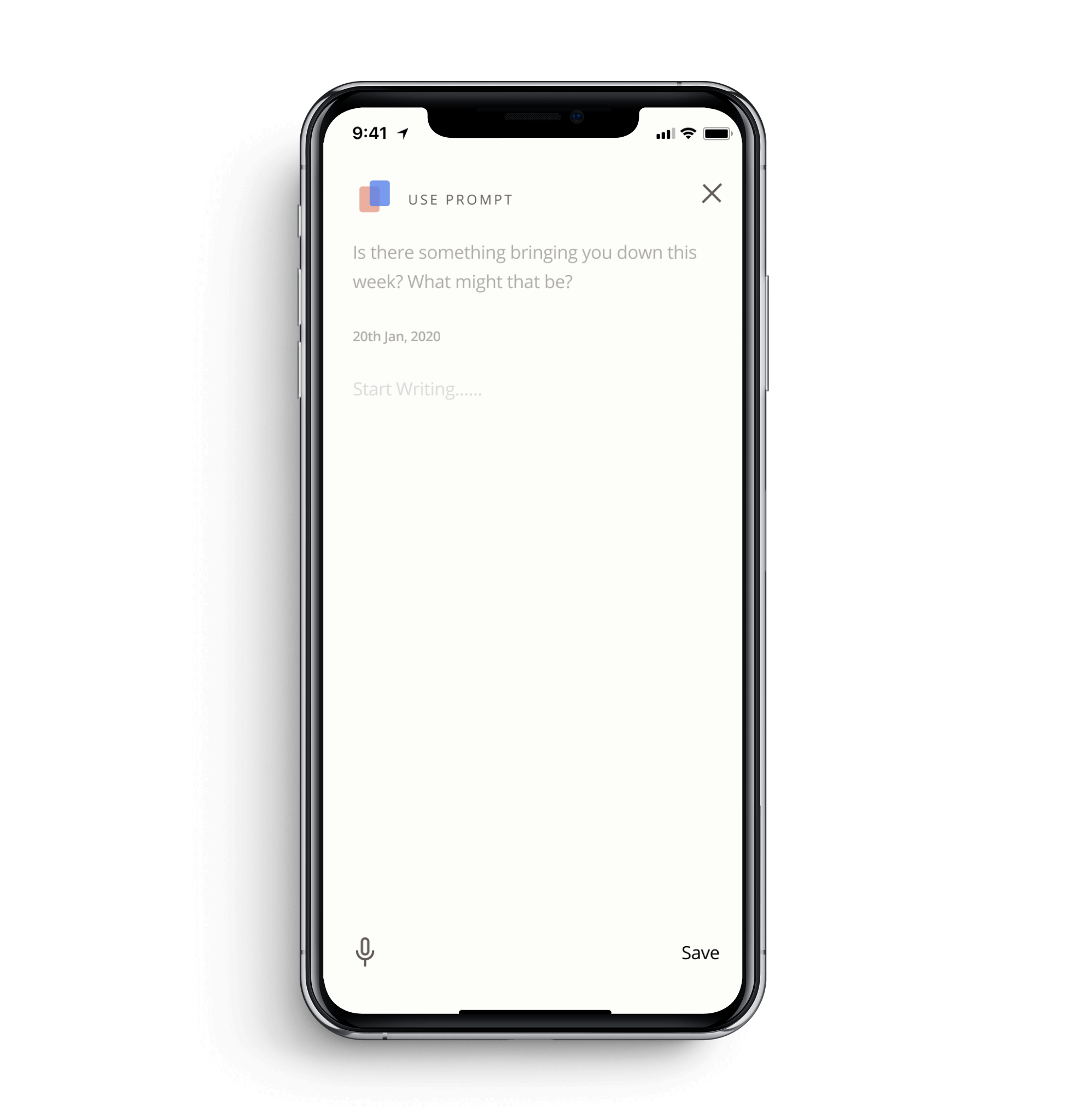
Guided Prompt as a Kick-starter
Users who need a kick-starter to write have the option to have a guided prompt for each journal entry.
The prompt motivates users to have effective reflections through their journal writing.
DESIGN SYSTEM
Bridging Between Design and Development
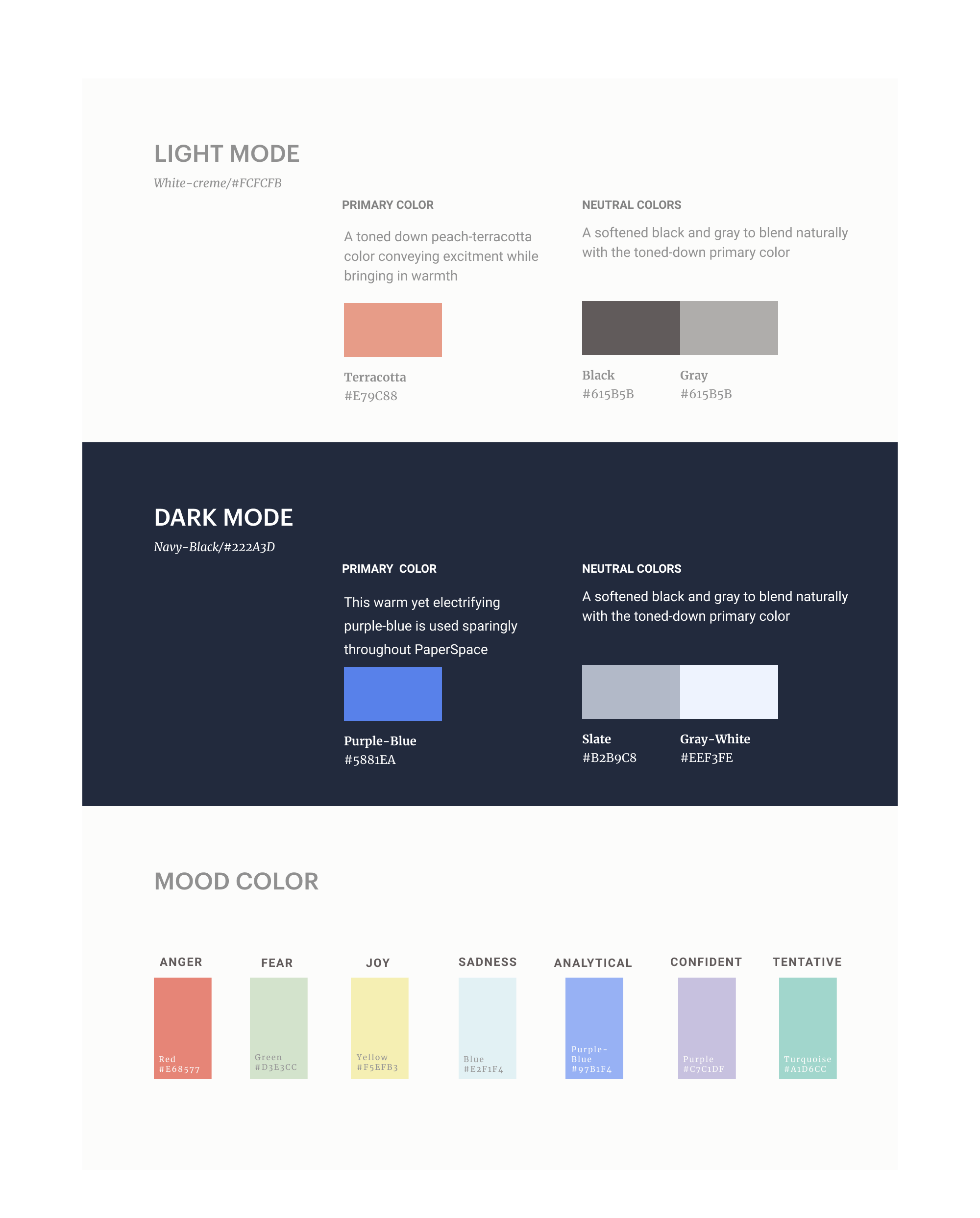
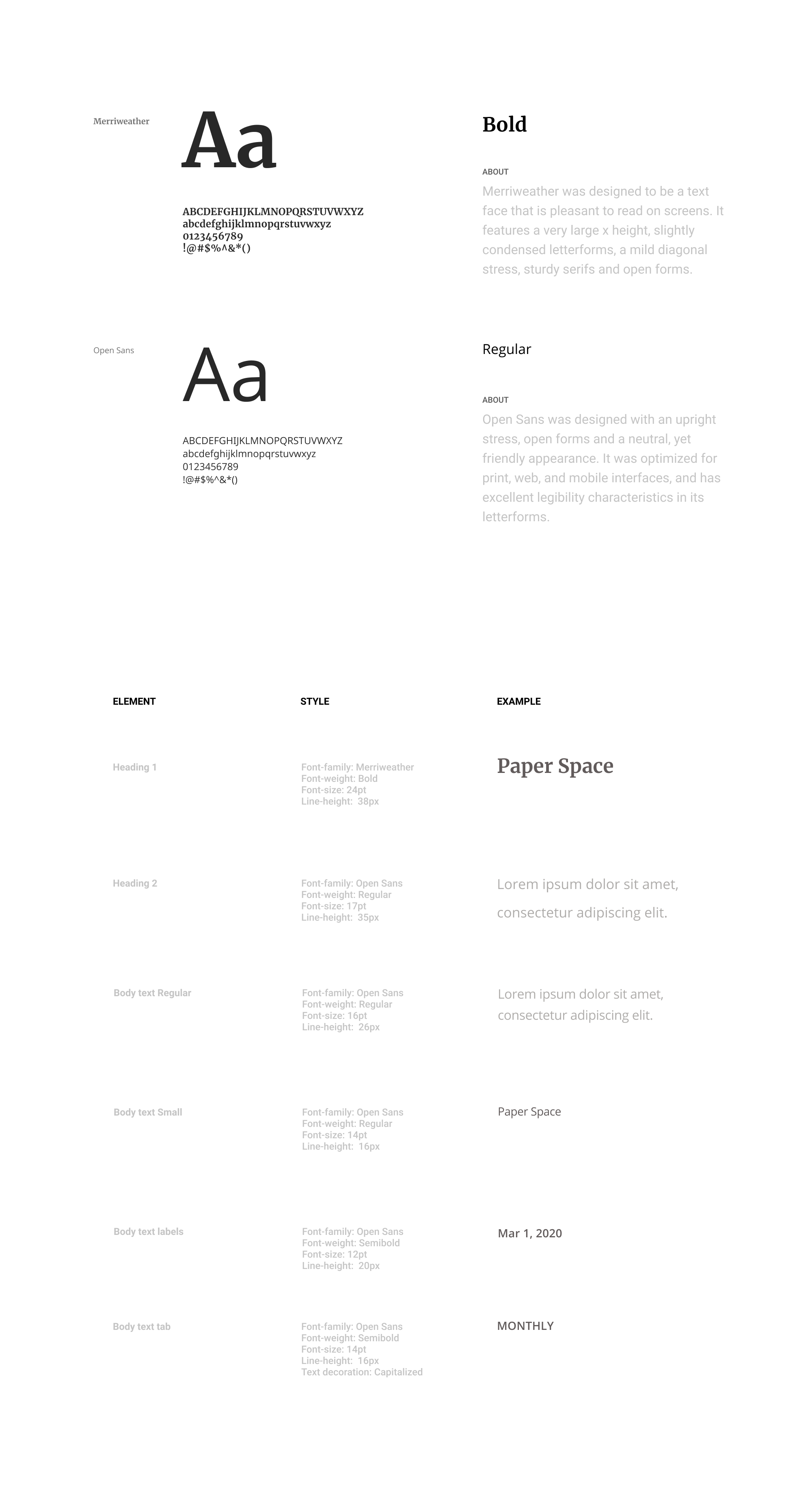
Setting up a standard is the key to keep the visual consistency when transitioning from design to development. The design system allowed us to keep our code align with the design and improve our efficiency during collaboration. Our group member has a more detailed elaboration on how it is executed.
COLOR
TYPOGRAPHY
We went for the MERN stack and we were using SCSS nesting and BEM naming method. In the development phase, I was mainly responsible for front-end development such as assisting with creating React components, setting up Watson Tone Analyzer API, and creating CSS transitions and visual effects. Here’s an overview of the development flow:
REFLECTIONS
Things that I Learned
01. Balancing between Desirability and Feasibility
This project was not merely a design project. Knowing that we need to develop the product puts various constraints on us. We learned to balance between what the user wants and what we could do, this includes what technologies we were able to apply and how much time we had for this project.
02. The Importance of Design System
The design system offered a standard and guide for the team to keep the consistency when developing. Our design system library is relatively small, I could definitely see its importance when the scale is larger.
03. Remote Collaboration Experience
Due to the Covid 19 in 2020, the second half of the project is completed remotely. We developed remote collaboration skills through this process. There are several tools we found helpful for our communication such as Notion for documentation and Jira for process tracking.
